
Copper from the Jazz Age… in Belgium!

| Type | Two tin-lined saucepans in hammered finish with iron handles fastened with three copper rivets and fitted lids with iron handles fastened with two copper rivets | |
| French description | Deux casseroles étamées et martelées avec queue de fer munie de trois rivets en cuivre et couvercle a degré avec queue de fer munie de deux rivets en cuivre | |
| Dimensions | 29cm diameter by 21.5cm tall (11.4 by 8.5 inches) | 30cm diameter by 22cm tall (11.8 by 8.7 inches) |
| Thickness | 2.4mm at rim | 3mm at rim |
| Weight | 7106g (15.7 lbs) pot only; 9364g (20.6 lbs) with lid | 8688g (19.2 lbs) pot only; 10950g (24.1 lbs) with lid |
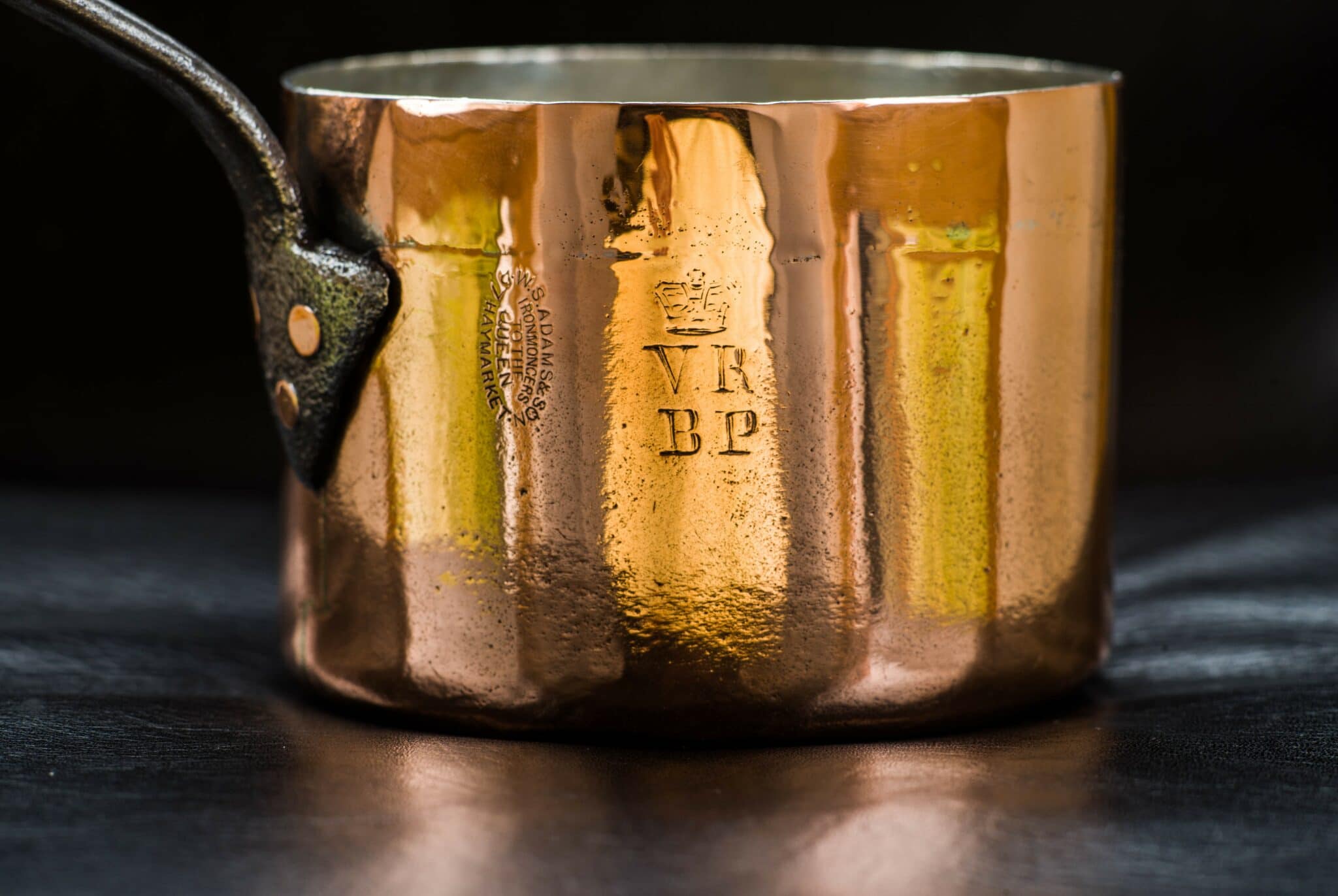
| Stampings | Mson VAN NEUSS H. POMMIER BRUXELLES ROBERT’S LE ZOUTE BZ HBV K 30 |
Mson VAN NEUSS H. POMMIER BRUXELLES ROBERT’S LE ZOUTE BZ HBV K |
| Maker and age estimate | Pommier; early 1920s | Pommier; late 1920s |
| Source | Private sale | |
These two beautiful old saucepans are the work of Hippolyte Gérard Pommier, a 20th century Belgian coppersmith with a family legacy from the 19th. Apprenticed to his grandfather Michel Vanneuss in the 1880s, Hippolyte took over the family chaudronnerie in 1901 but kept his grandfather’s name alive for thirty more years. (For a more complete history, please see my field guide to Pommier.)
These two saucepans carry that homage mark — “Mson VAN NEUSS” for maison (house) Van Neuss — suggesting that they were made during the first period of Pommier’s production under Hippolyte, between 1901 and into the 1930s. They are special to me for this history but also for the owner’s mark they carry for Robert’s Le Zoute in Belgium. This bar-hotel operated for a mere six years from 1923 to 1929, giving us a well-defined time window to estimate both the age of the pots and the activity period for the stamp.
First let’s look at the copper and then at the history in the stamps.
The pots
The two pots look almost identical but they are not quite twins: the one on the left measures 29cm diameter (though it is stamped “30”) and the one on the right is a true 30cm. The 29cm is 2.6mm thick and therefore also a bit lighter — the 30cm is 3mm and weighs 1600g (about 3.5 lbs) more. I have come to suspect that while they were likely in use at the same period, they were made at different times, and if I had to guess which one came first it would be the 29cm.

The most apparent visual differences are the positioning of the handles and the treatment of the rivets. On the left is the 30cm with small button-head rivets; the 29cm on the right has its handle mounted lower on the sidewall and the rivets are larger.

Here are the two baseplates in more detail. I think the rivets on the baseplate on the 30cm (at left) have been finished with a machine tool to polish them, while the rivets on the 29cm (at right) have been hammered and have an irregular faceted look. This is not necessarily an indication of relative age — after all, a maker could certainly use both machine tools and hand hammers at the same moment in time — but it does suggest that the 30cm was made with a more modern mechanized technique than the 29cm.


Inside, both pots have flattened rivets. I could see no difference in the treatment here.


Interestingly to me, both pieces are dovetailed. This is a bit late for this technique, in my opinion; the acetylene torch was invented in France in 1901 and, according to a historical study of the industrial revolution, welding had supplanted most other industrial metal joining techniques by the 1920s. But there is no hard-and-fast end date for dovetailing, and furthermore, Pommier was a Belgian maker in Brussels, not the industrial city of Paris. There are multiple possible explanations for why these pieces were not deep-drawn or welded: perhaps Pommier had not yet made the investment in hydraulic presses or welding torches; perhaps these were special orders, more convenient to hand-make one at a time rather than to set up a full production line.
Whatever the cause, both have jagged yellow seams running around the base and up the side under the handle. To my eye, the craftsmanship looks different between the two: the 29cm has nine “teeth,” while the 30cm has eleven. This suggests to me not only that this work was done at different times, but also by different people.


The cast iron handles are of a similar enough shape that I believe they come from the same supplier, though likely from different production runs.

The handle of the 29cm pot looks rougher to me. It’s not just the surface appearance of the iron — that pitted appearance could be from casting defects, impurities in the iron, or extended surface corrosion — but also the level of finish. The inner surface of the hanging loop on the 29cm handle is ragged enough to catch a thread, while the 30cm handle is somewhat smoother.


The lids
Each pan comes with a fitted lid, but while the 29cm lid was likely made for its pot, I think the 30cm lid was a later addition.

The lids handles are subtly different. They both have the same overall shape: a lozenge set into the curve of the lid’s rim, anchored with two rivets. But look at the hanging loops: the 29cm lid (at top in the two photos below) has an egg-shaped loop, while the 30cm lid has a distinct keyhole shape. Also, the set of the handle shaft is different as well: the 29cm has a more pronounced rise from the baseplate to the shaft.


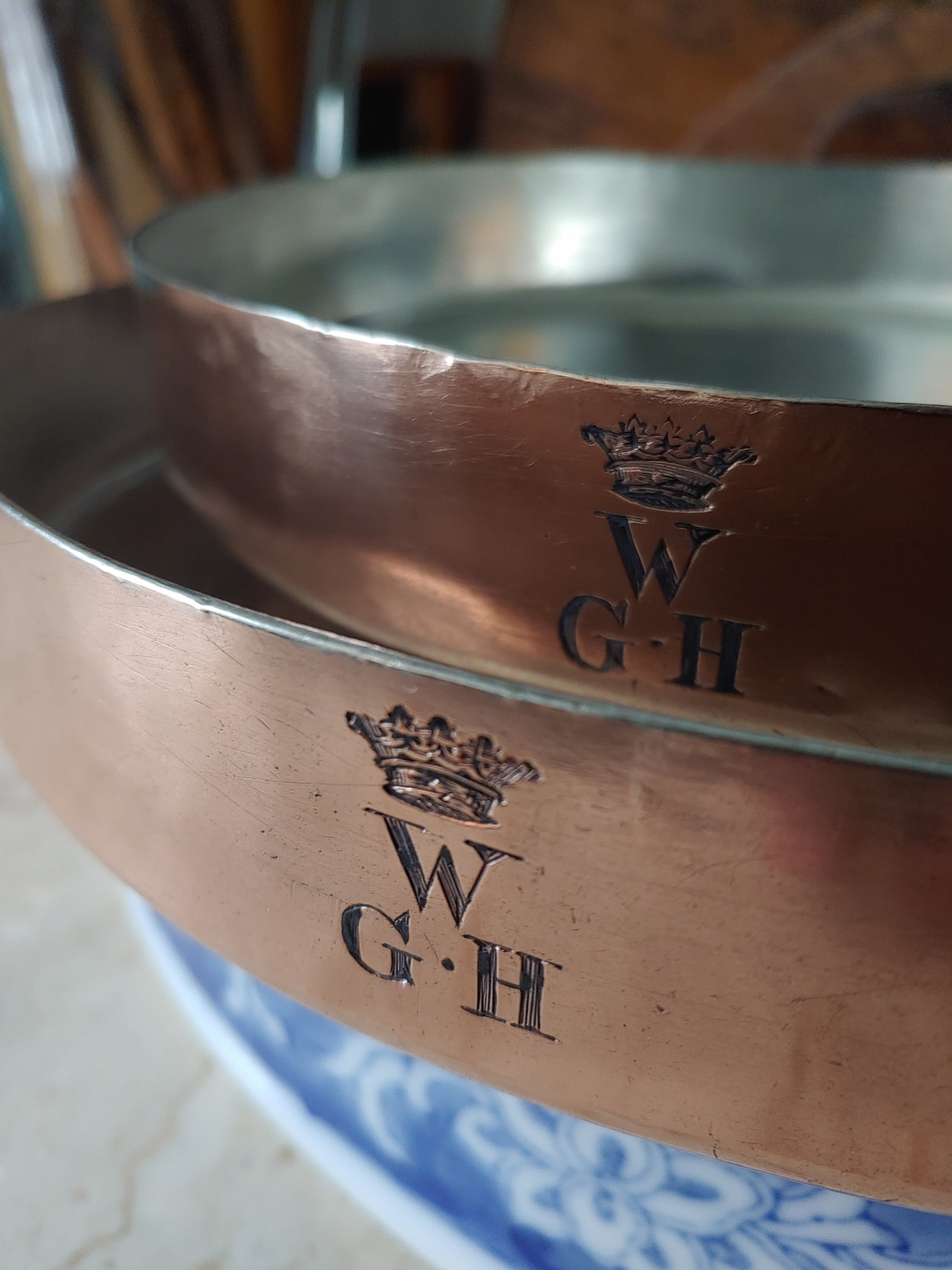
There’s another clue that these lids were made at different times: the stamps. The 29cm lid has the same “Mson VAN NEUSS H. POMMIER BRUXELLES” stamp as the two pots, but the 30cm lid has a simpler two-line “H. POMMIER BRUXELLES.” Also, the 30cm lid does not have a Robert’s Le Zoute owner stamp and so it is not bound to the 1923-1929 time window.


I suspect that the simpler stamp came after the Mson VAN NEUSS version, towards the end of Hippolyte Pommier’s life. He died in 1936 and while the company continued after his death as a corporation, I believe the managers chose to omit the Van Neuss name and continue as H. Pommier only.
The owner’s marks
In addition to the maker’s marks for Pommier, the pots and their lids carry an assortment of owner’s marks: “Robert’s Le Zoute”, “HBV K”, and “BZ.” The first is easy to identify but I am less certain about the other two.
Robert’s Le Zoute

Both pots and the 29cm lid carry a stamp for “Robert’s,” a bar-hotel in the Zoute, an oceanfront area of the the Belgian seaside resort town of Knokke in Western Flanders. (“Le Zoute” in the stamp was the French rendering of the town’s name.) This is the clearest of the owner’s marks and also, I believe, the earliest.
Robert’s was founded by Robert Vermeire (1891-1976). Robert was the son of hotelier Louis Vermeire, who built the Hotel de Prince Baudouin in 1886 as the first tourist hotel in the area (still running to this day as the Prince Baudwijn). Robert went away to Germany at the tender age of 15 to a hotelier school to learn his father’s trade and took to it well; by 1909, at age 18, he was managing his father’s bar in Knokke.
Robert was ambitious and set his sights beyond the limits of Knokke. In 1914 he traveled to London where he worked at two high-profile establishments, the Royal Automobile Club and the Criterion Restaurant. He had a talent for hospitality and in 1920 he ascended to the pinnacle of bartending excellence: the Embassy Club on Old Bond Street, the most exclusive of the jazz clubs in the city, where the Prince of Wales mingled with the “fast set.” In 1922 Robert published “Cocktails: How to Mix Them,” the very first book with drink recipes, tips for measuring and making them, and even the stories behind their invention. The book was a huge success and sold more than 100,000 copies in multiple languages. (You can still find the book in used bookstores but if you simply want to read the text, I have a text-only version.)
By 1922, Robert was 31 years old, professionally trained at the best clubs in Europe, and a published author. The timing was right to return to his hometown to launch his own venture. In 1908 the town of Knokke had extended its ocean dikes to create a new stretch of seashore called the Zoute, and Robert was able to purchase an undeveloped lot at 8 Albertplein. He built “Robert’s” as a hotel, restaurant, and bar, and opened its doors in 1923.

His timing was impeccable. This was the great inter-war era of tourism in Knokke, and Robert used his friends and international connections in London and Europe to draw an exclusive clientele. His hotel-bar was a roaring success. Robert had a gift for innovative entertainment: he invented new cocktails, set up a separate bar in the basement, and marketed day drinking as a “morning aperitif.” It didn’t hurt that the strict Prohibition laws in the United States sent Americans across the pond in search of legal nightclubs; by 1927 Robert’s Hotel Bar was ranked at a respectable number 25 in the International Bar Flies’ list of “Traps.”
(I heartily recommend the 1927 edition of Barflies and Cocktails not merely for its wealth of recipes but also for its insight into the culture of its time. Standout cocktail recipes include the Bosom Caresser; the “L. G.” Cocktail [“one glass of Scotch Whisky, one glass of Beer as a chaser. Note: Favorite drink up in Scotland of the Labor M.P.’s”]; the Monkey Gland Cocktail [“Invented by the Author, and deriving its name from Voronoff’s experiments with rejuvenation”]; the Scoff-Law Cocktail [“already become exceedingly popular among American prohibition dodgers”]; and the Three-Mile Limit Cocktail [“one of the effects of the Volstead Act, people get busy outside of the three miles”].)
But alas, Robert’s candle burned at both ends and the financial crash of 1929 dashed his fortunes. He declared bankruptcy and sold the hotel. Today the building at 8 Albertplein is the Savoy Hotel.
HBV K
 Both pots and the 29cm lid also carry the initials “HBV K” and I think this is for the Hotel de Belle Vue in Knokke, built circa 1914 at 7 Albertplein next door to the empty lot that would become Robert’s a few years later.
I found a postcard from the late 1910s or early 1920s showing the Hotel de Belle Vue standing alone on the street. A second postcard taken later — likely in the 1930s — shows how the area had been built up. (That is Robert’s to the left of the Belle Vue.)


And here are some undated interior photos of rooms and salons in the hotel. (I don’t know about you but I love these old postcards — it helps to imagine these copper pots hard at work behind the scenes to feed the fine ladies and gentlemen vacationing at the seashore.


I do not know when these pots were at the Belle Vue. The sans-serif font used for the HBV K looks like a mid-century style to me, which suggests the 1940s or later. Knokke and the Zoute survived the German occupation, but just barely; the oceanfront hotels were emptied out and many buildings were destroyed. Canadian forces liberated the city in November 1944 (a march commemorated annually in the town), but the area came under heavy artillery fire. After the war, the hotel operators worked hard to restore the tourism industry but the glorious inter-war era of month-long summering had ended. According to Andre D’hont writing in 1986 in “A memory of hotels of that time,”
Few hotels have survived the times in Knokke. Apartment buildings replaced the vital institutions for the seaside town and the long façade by the dike changed completely from the 1960s onwards. As had been the case in the pre-war period, the hotels no longer had guests staying for two weeks or a month. Those who could afford it bought their own apartment and the builders responded to the trend. It was also an opportunity to dispose of older hotels at a time when there was an urgent need for modernization.
I do not know for how long the Hotel de Belle Vue continued to operate after World War II. In D’hont’s article from 1986, he lists it as vanished by 1970 but does not specify when. But though the hotel did not survive, the building with its distinctive peaked roofline continued into the 21st century. In 2017 it was demolished to make way for a new residential development called the One Carlton, “a new global icon in the heart of Knokke.”
BZ
The third owner’s mark shows up on all four pieces: BZ.


I am not sure what to make of this stamp. The serif font looks like early 20th century to me — that is, from the 1910s to the early 1930s, before the plainer-looking HBV K. But there are also reasons to place the BZ stamp after the HBV K. For one, HBV K is only on the three pieces with the earlier Pommier stamp whereas the BZ appears on all four, including the 30cm lid with what I believe is the post-1936 Pommier stamp. Of course, I do not know when the 30cm lid found its way to that 30cm pot — it could have been decades later. If I knew what BZ stood for, I might be able to narrow down the timeframe, but I don’t — I suspect the Z is for Zoute, but the B could be any number of hotels.
So this stamp remains a mystery! I will file this in my mental file cabinet under “Unresolved Things” and keep an ear perked for more information. As always, if you have a suggestion here, please let me know in the comments!
Sources
This was a fun post to research. My research began with “Looking for Robert Vermeire” by Francois Monti, and lead me to “Forgotten Figures: Robert Vermeire, a Knokkenaar known in the world of ‘Cocktails’” (in Dutch) with a more thorough history. The town of Knokke has an interesting story as well — in its heyday it was a thriving resort town with hundreds of hotels. “A memory of the hotels of that time” (1986, in Dutch) lists them all and narrates the growth and decline of the tourist industry in Knokke and Zoute.


Beautiful pans and excellent research on their interesting history.
Thank you Stephen!
Brilliant natural history and interpretations. And, of course, absolutely beautiful pans. Thanks for the research.
Thanks Phil!
Which is more magnificent – the pans or the story that VFC dug up? I congratulate the “Queen of Research” on both..
Happy New Year to VFC and all copper lovers!
Ein glückliches und friedvolles Neues Jahr!
Bonne année!
Thank you, Martin! Happy New Year to you as well!
Fantastic pans with quite unique handles on the lids.
I believe I have seen one of these pans with lid and similar dimension ratios, though with different markings.
I will try to go back for and get a better look.
Thank you for sharing this!
@VFC, I think the diameter in inches is missing a 1 on the 2nd pan.
Sorry to be a stickler…;>)
Take care, Greg
Thanks Greg — I would love to see more examples! And thank you for the correction on the diameter. I caught another garbled sentence in the post after it was published, too. Both fixed now. But my proofreader is fired!!
(Narrator: VFC has no proofreader.)
Happy New Year’s Eve, everyone!