
This handsome fellow epitomizes the graceful copper of the inter-war period of France.

| Type | Tin-lined saucepan in hammered finish with cast iron handle attached with three copper rivets |
| French description | Saucier étamé et martelé avec queue fonte en fer munie de trois rivets en cuivre |
| Dimensions | 32cm diameter by 18.5cm tall (12.6 by 7.3 inches) |
| Thickness | 2.6mm at rim |
| Weight | 6830g (15 lbs) |
| Stampings | BLASER & CIE 59 61 Rue Montmartre Paris; SCAC |
| Maker and age estimate | Unknown; 1920s-1930s |
| Source | FrenchAntiquity (Etsy) |
This saucepan has store and owner’s stamps but no maker’s mark. It is the store stamp that helps to estimate this piece’s age and also, in my opinion, establishes it as work done between the first and second World Wars.

This stamp is for Blaser & Cie, a store in Paris at 59 and 61 Rue Montmartre that was active in the late 1920s. You may recall that Stephen W.’s 30cm oval cocotte also bears this stamp (and a more clear example at that) — I attempted to trace this store without much success, and I am grateful to TJFRANCE for his more complete research on this subject.
Figuring out the timeframe for this stamp requires stringing together some sparse data points. The trail begins in 1928, which is when TJ first spots Blaser & Cie in business. I can’t confirm that date with my own research but I do see founder Alfred Blaser (1874-1973) liquidating the firm “Blaser & Cie” in 1935. However, that does not appear to have been a final closure but instead a step in transforming it from a sole proprietorship to a corporation, as TJ again sees the firm in the 1940s as the restaurant supply business Établissements Blaser, which continued until 1973.
What this suggests to me is that the store was known as “Blaser & Cie” for a relatively short period of time — from 1928, say, until about 1935. I propose that this stamp was applied to copper pots sold during that time window, as the two pieces I have had the opportunity to consider in detail — Stephen W.’s cocotte and this saucepan of my own — both bear craftsmanship that I believe is appropriate to this period.
Like most 20th-century copper production, it is machine-formed and hand-finished, but it is the balance of the two that leads me to place it in the inter-war period (that is, early 1920s to late 1930s).

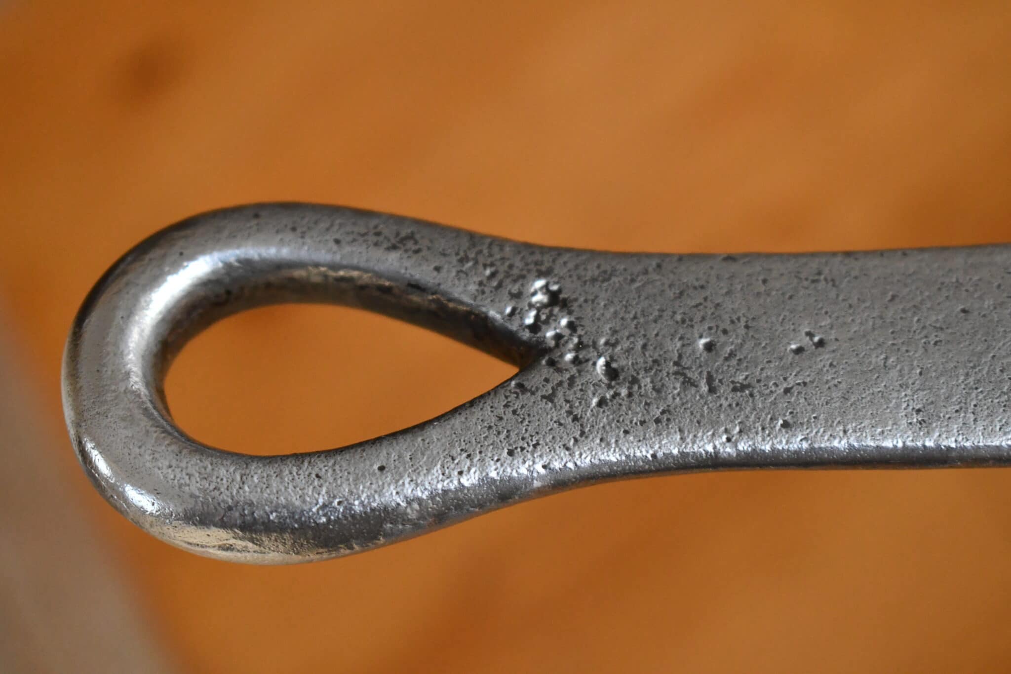
Let’s start with the handle: it is cast iron that has been beautifully finished.

Reader Bryan P.’s recent post on his windsor taught me something new: some of the irregular marks we see on cast iron handles are traces of the mold from which they came. In particular, Bryan taught me about the “gate,” which is the slot in the mold through which the iron is poured. Bryan believed he spotted the gate on the left side of his windsor’s handle close to the baseplate, and I see a similar mark in the same location on my pot as well.

Here is a closeup view. It looks like a gate to me, but it has been filed or polished down to reduce it.

Other signs of attention to detail are on the baseplate. The seam lines left by the two pieces of the mold have been filed down — not perfectly, as there are some visible scoring marks on the shoulder, but better than others I’ve seen.

Though the maker took some time to even out the rough edges on the handle, there are some minor casting flaws. There are some cavities around the hanging loop and the shaft has a slender but still noticeable inch-long crevasse along the side. But these are cosmetic issues, not structural — I point them out more as curiosities than anything else. The handle is well-shaped and smooth in the hand.

 It’s a lovely piece. It comes to me from Steve Nash at FrenchAntiquity, who has a nose for high-quality pieces. This saucepan appears to have experienced what I would consider “light institutional use”: it is restaurant-scaled, but at 2.6mm thickness it is not as burly as pieces made for truly demanding environments. The owner’s mark — “SCAC” — leaves me no clues as to the identity of its former user, but the fact that it does have a stamp like this is another nod towards the pre-WWII period. In my experience and observation, owner’s marks fell out of practice after WWII.
It has been beautifully restored. The tin inside is clean and luminous. The surface was hammered but the finish has softened with polishing to a subtle ripple.

My thanks as always to Steve Nash for sourcing and making this piece available.


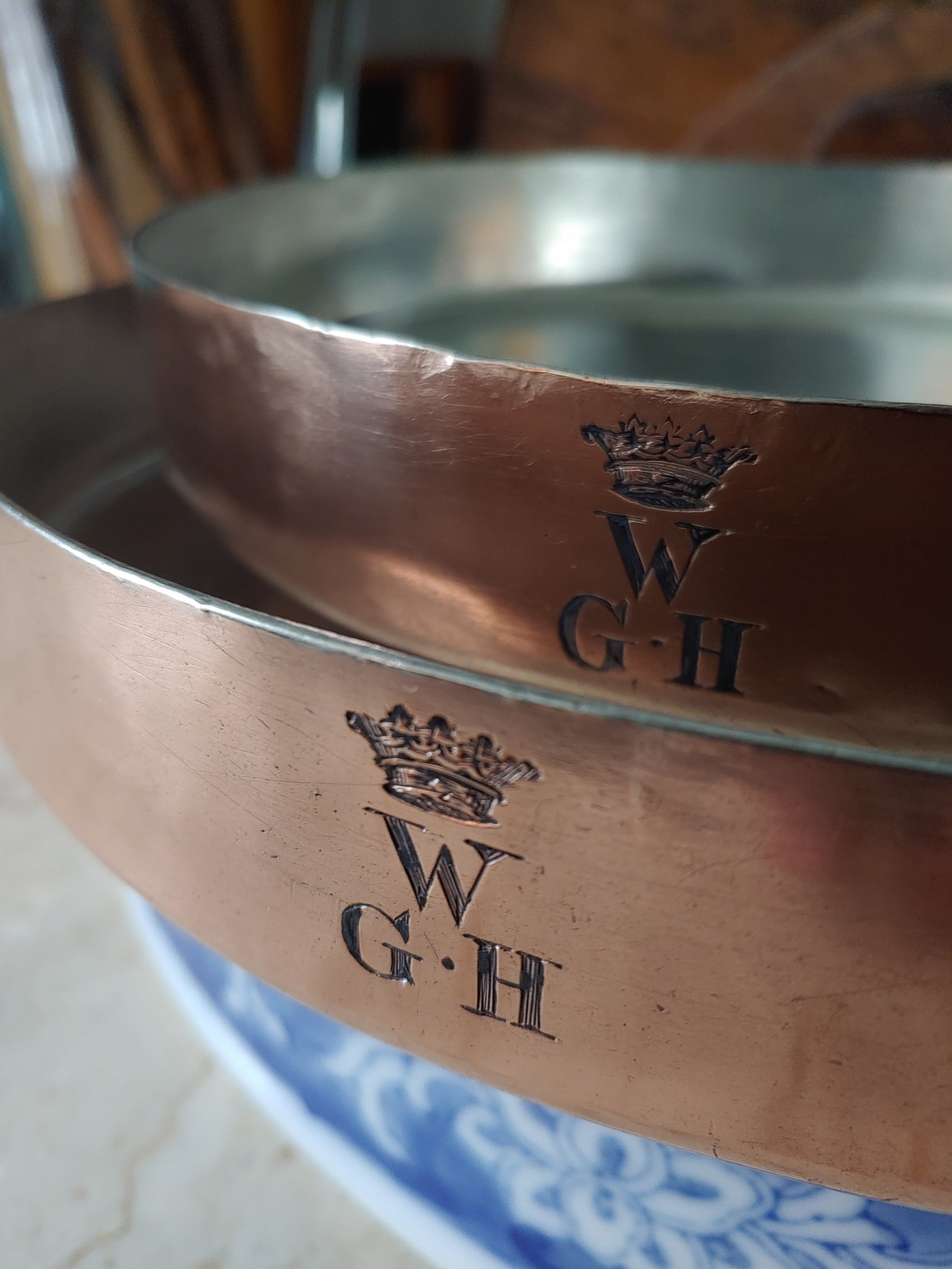
Interesting font used for the owner stamp, particularly the rotated omega shape ”C”. This must surely have been done by the owner.
Roger, I agree. I have developed a couple of working assumptions: properly aligned typeset lines are maker’s marks or store stamps, while higgledy-piggledy letters like that are owner’s marks. The exceptions? Some large estates appear to have maintained a proper owner stamp for the extensive sets of copper in the kitchen, and also there are some owner’s marks that are actually engraved and not stamped. Engraved marks tend to be beautifully aligned and can look like a stamp from a distance.
Another fine addition to your commercial sized saucepans with the relatively rare Blaser & Cie stamp making it a bit more special.
I wonder if the owner’s stamp consists of two pairs of letters (SC and AC), and the raising of the letter C is not negligence but intent? This is supported by the fact that the increase is similar and the distance between the imaginary pairs is a tiny bit larger. Just speculation.
I know this is a shot in the dark but I am convinced that this “C” is the Greek letter Omega, used as a trademark by the Swiss watchmaker, in electronics for ohms the unit of resistance/ impedance and by the Catholic church, alpha and omega meaning God the beginning, end and everything. It is not a letter in a standard set of punches.
I am thinking that the last letters might be Augustine convent and the first two the location. This would account for light institutional use and possession of this stamp.
Roger, it is a beautiful and unusual shape, isn’t it. To me, it looks like a letter G without the cross-stroke. My study of copper stamps has kindled an interest in typefaces as well — this example makes me wonder if for this letter set, a G was formed from a C with a little second stroke added.