
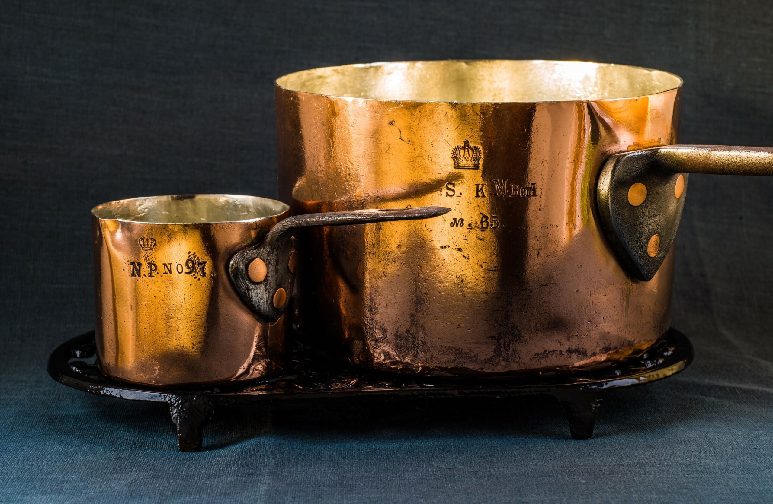
What’s with the little tail?
Look closely at the base of the vertical stroke of the capital J. There’s a little extra mark there. It’s intentional — it shows up on multiple versions of the stamp.
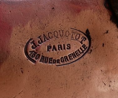


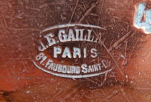
I first spotted this style of J in the Jacquotot stamp but it also appears in certain Gaillard stamps. There it is on the J.E. Gaillard stamp at right, and TJFRANCE’s Gaillard stamp page has other examples from the J. & E. GAILLARD and J. GAILLARD stamps. (It doesn’t show up in sans-serif Gaillard marks such as the two-line text marks or the Jules Gaillard stamps.)
What is this funny extra mark called? Why do I only see it on French copper stamps? To the Interwebs!
It turns out that the letter J is a relatively recent innovation in the written Latin alphabet. It emerged in the Middle Ages as an addition — typographically, a swash — to the letter I. (The history of the sound of J is more complicated and I direct you to the Encyclopedia Britannica for a concise explanation.) According to Materia Medica (1918), it was the practice in medieval prescriptions to add a swash to the Roman numeral i as a measure against errors in quantity:
In a number with terminal one, as one, two, three, seven, or eight, the last letter is printed j, or written as i with a stroke projecting below the line, e. g., ij, iij, vij. This is to signify that it is terminal. Errors have been made because of a comma inadvertently added, and even because of some mark, such as a fly-speck, upon the paper.
 But this “i-swash” lower-case j was a modification of notation, but not a distinct letter on its own. The use of J as its own letter didn’t happen until the Renaissance: In 1524, the Italian scholar Gian Giorgio Trissino wrote to Pope Clement VII to inform His Holiness of additional letters coming into popular use in written Italian. It would appear that vowels were emerging as consonants and needed to be notated differently in writing — among them, the consonant J differentiated from the vowel I.
Here is an excerpt from Ɛpistola del Trissino de le lettere nuωvamente aggiunte ne la lingua italiana (“Epistle by Trissino of new letters added to the Italian language”):
Below I am talking about noting the difference, which is between i and u, when they are consonants, and when they are vowels; and however, when they are vowels, they will be written in the usual way; but, when they are consonants, i will be written for a long j, extending below the line, and u for an old v.
To this day, the Italian term for the letter J is I lunga — “long I”.
The derivation of J from I seems to have persisted in formal French typography into the early 20th century. The images below are from Album de chiffres & monogrammes couronnes de noblesse, françaises et etrangères : armoiries et écussons (“Album of numbers and monograms with coronets for nobility, both French and foreign: coats of arms and crests”) published in Paris in 1903 by Ch. Crouvezier. The book is intended as guide and inspiration for artists and engravers and offers a range of alphabets and monograms ranging from simple to fantastically elaborate. It’s a gorgeous book and I encourage you to look through it if you have a few moments.
The design below is the first one, perhaps intended as a “starter” alphabet for general use. There it is, the Jacquotot J: it’s an “I-swash” that retains both the upper and lower serifs. (You can see something similar with the L as well.) I believe the letter J in the font used in the Jacquotot and Gaillard stamps also retains the serif at the base from the original I, and that’s the little extra mark I see in the copper stamp.

Looking through the rest of the alphabets presented in the book — and there are several, and they are beautiful — I have come to see the comparative advantages of this crisp I-swash design. As the typography grows more elaborate and starts dropping serifs and bending strokes into curves, the swash of the J — necessary for the reader to recognize the letter — can get lost.
Take a look at this more florid alphabet below. How is one to tell the I from the J?

Below is another example. The decorative circles hovering at the midline of the letters add more confusion. Look at what’s happening to the F: the designer added a ribbon to provide that crucial cross-stroke, but to my eye it could be mistaken for a stylistic element.

And finally, here’s a third example. The artful zig-zag arrangement of letters places F, I, and J in close proximity and my modern eye finds it hard to tell them apart. And is it my imagination or is the P also getting into the mix?

Don’t get me wrong — I love these designs. These are not intended for typesetting, and I expect the designer’s objective was beauty and balance before legibility. Continue deeper into the book and you’ll find increasingly more elaborate monograms with letters that overlap and intertwine like century-old vines on a stone wall.
These are designs from an era when literacy was not as common as it is today. I think elaborate monograms stitched and stamped onto linens and handkerchiefs and housewares and stationery were not intended to be read so much as recognized. Liberated from the strictures of legibility, they spread and flourish and bloom.
Not so the straight lines and crisp serifs of the Jacquotot J, of course. Jean-Baptiste put his name on his copper so that customers would read it and find his shop in Paris. But that curious little tail on the J — that unnecessary little tendril of the vine, a shoot left unpruned — reaches out to us, a remnant of life from an earlier era. I see it, and I hope you see it too.


Thank you for the instructive and downright poetic lesson. It never ceases to amaze me what one can learn from intensive study of old copper, especially when a knowledgeable guide shows new ways. I find your fine distinction between reading and recognizing remarkable.
Reading and writing was until a few centuries ago (and to some extent still today) a privilege of a small minority. And even this elite made use of particularly knowledgeable scribes who wrote letters and documents for them. Presumably, each of these scribes had his own style. Not to forget the numerous monks who transcribed the Bible or other ancient writings. It was probably not until the invention of printing that more uniformity in typefaces was created. Fortunately, legibility is no longer a problem today (at least with most fonts). But one has to accept the loss of beautiful handwritings.
Translated with http://www.DeepL.com/Translator (free version)
Martin, I’m glad you liked this post! Thank you!